MARK THORP

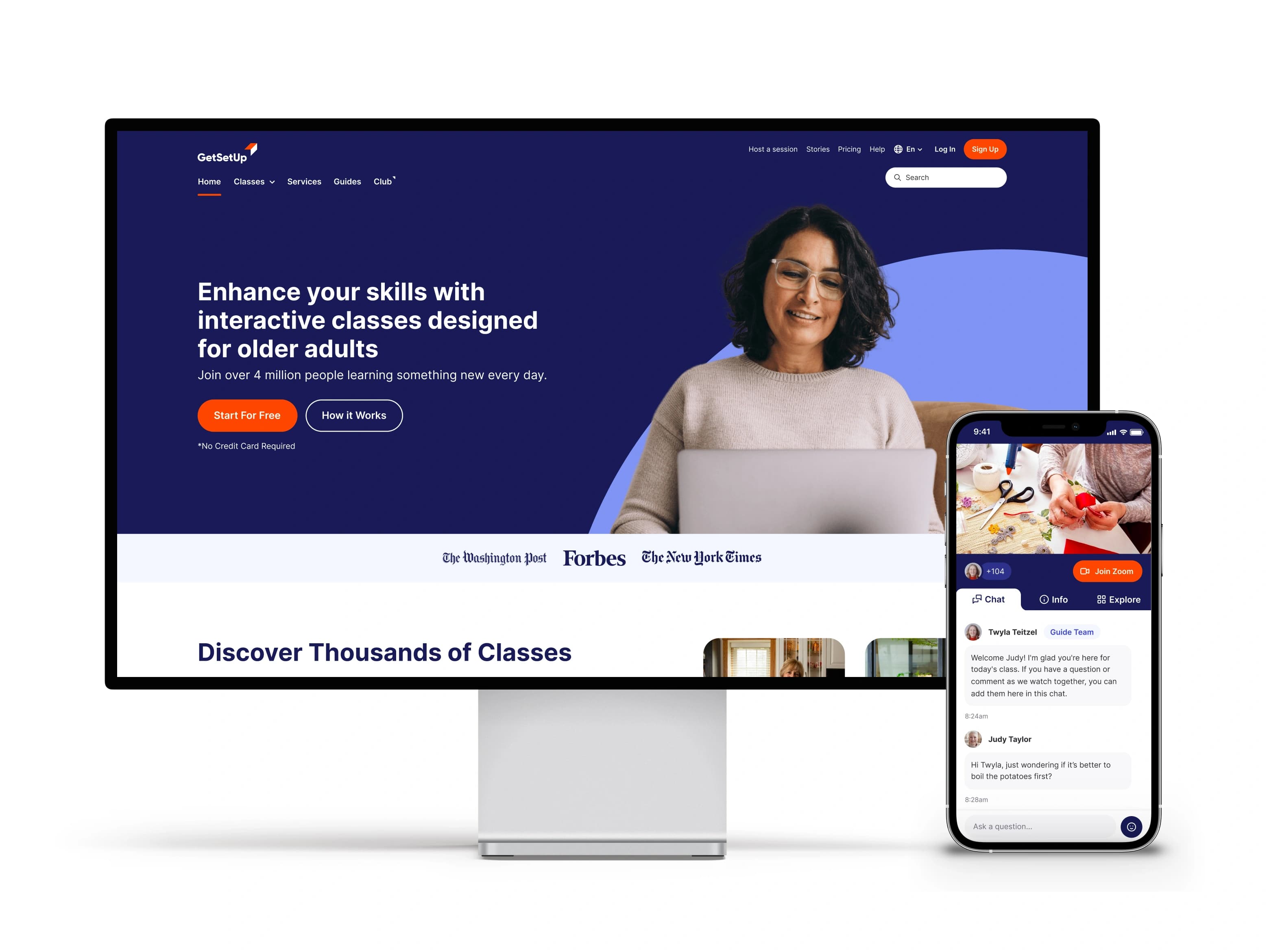
Visitor feedback showed that the landing page did not explain the product clearly. We redesigned the experience to explain the offer, demonstrate how classes worked and build trust through social proof.
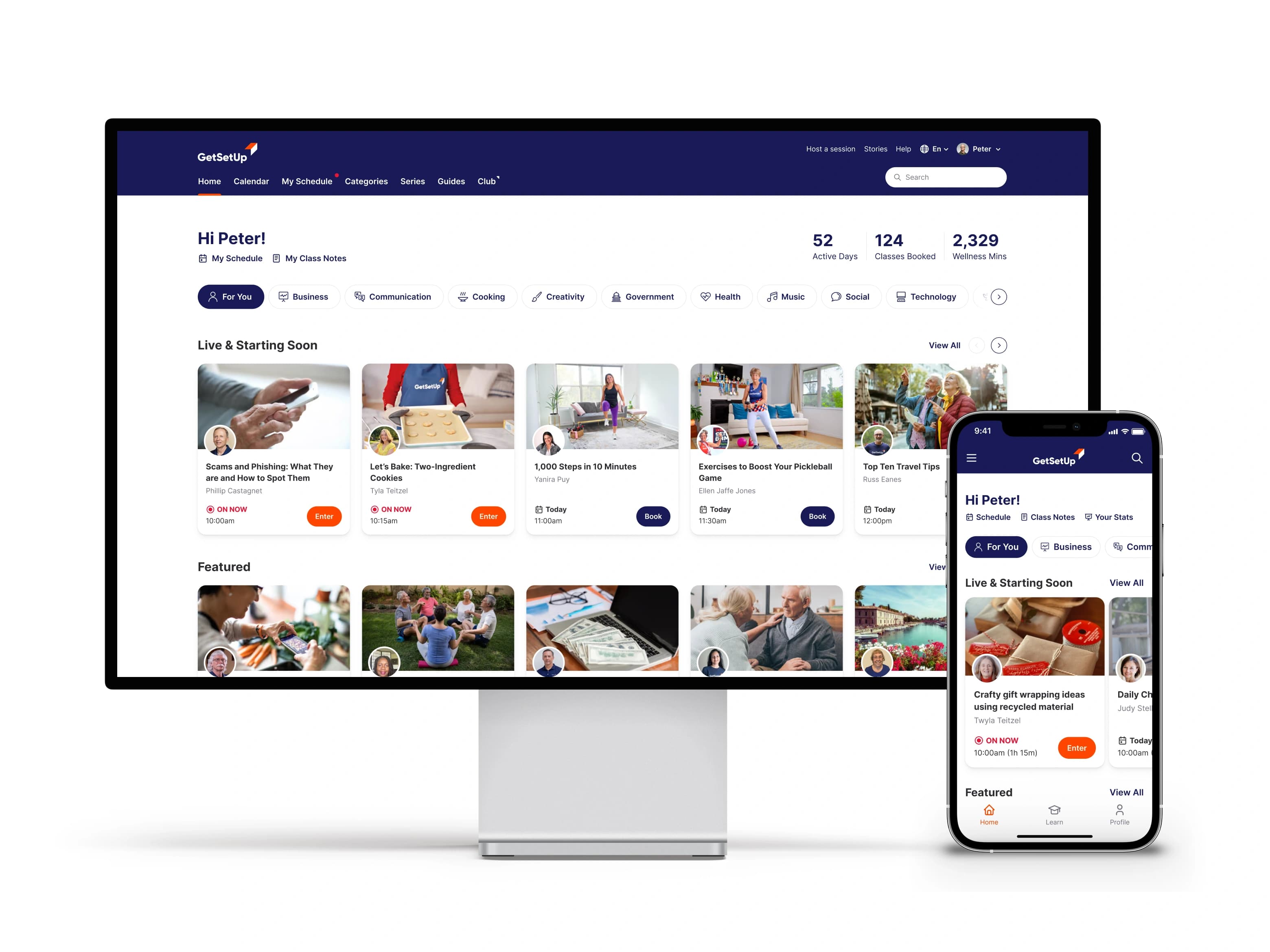
Qualitative feedback showed that learners often chose classes by guide. We increased guide visibility on class cards and introduced topic categories, making it faster to move from broad interest to a relevant live session.
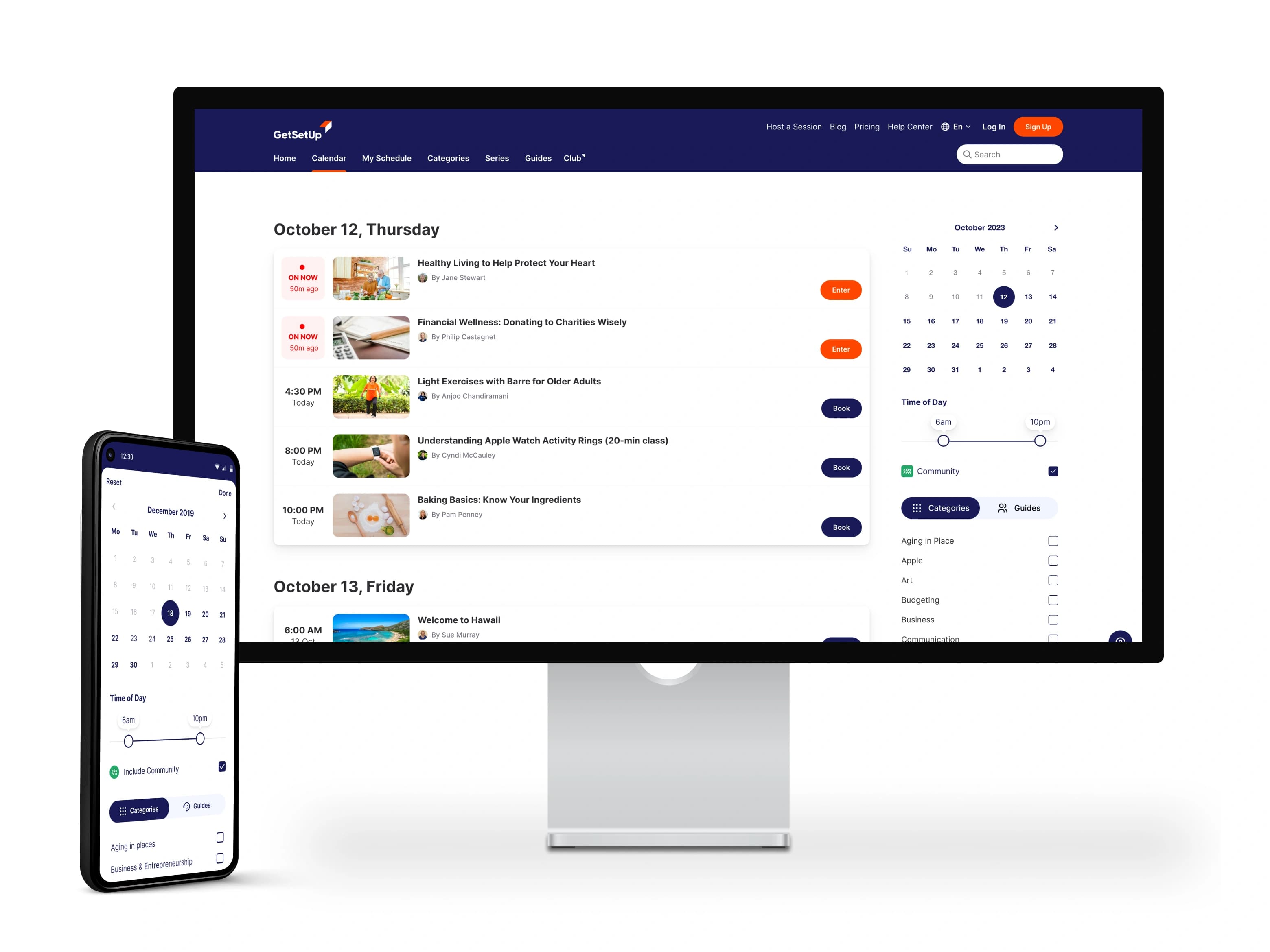
The calendar was rebuilt for smaller screens with simplified filters and a persistent, scrollable filter panel. The change produced a 16% increase in upcoming class bookings.
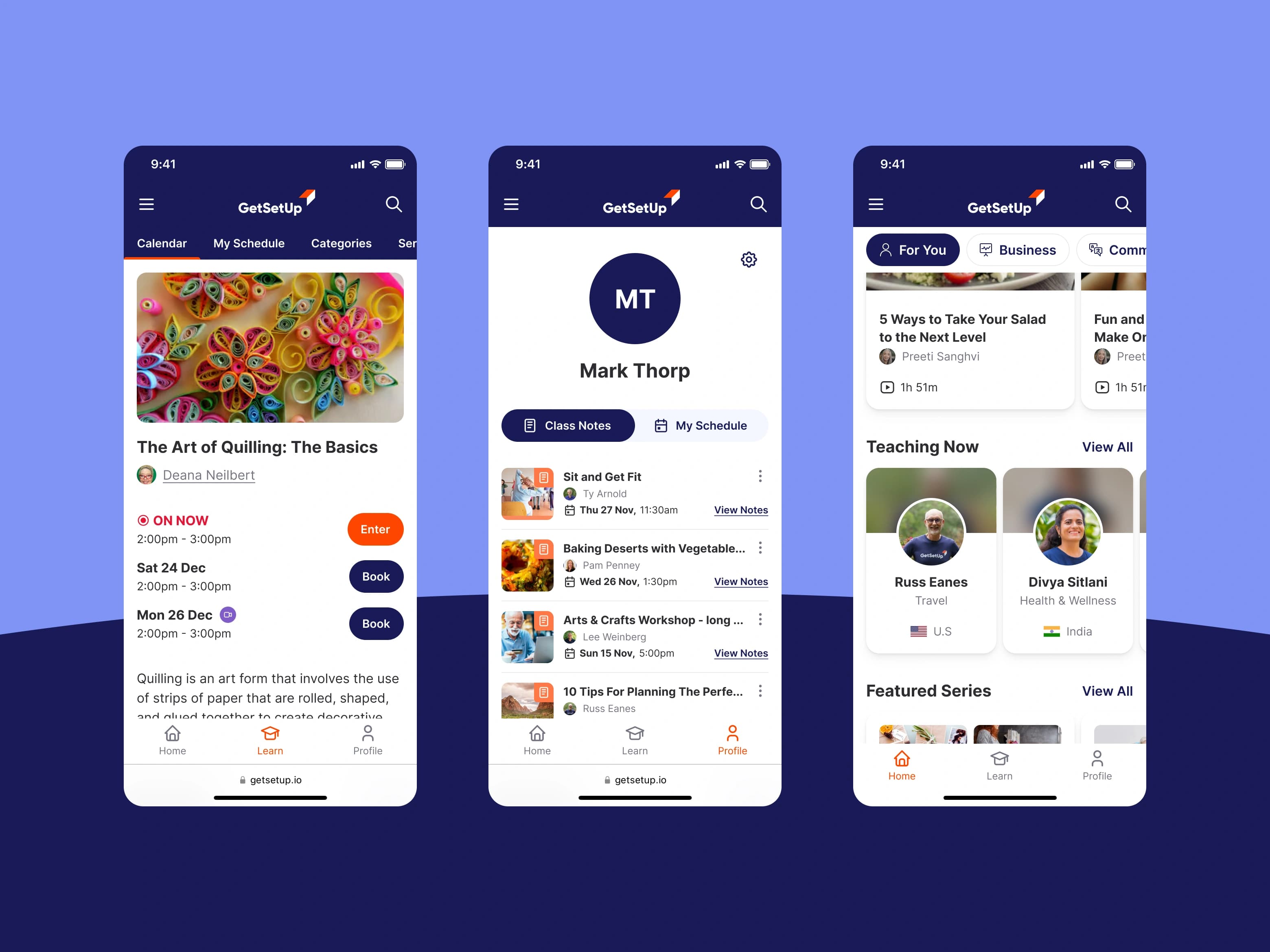
Responsive class, profile and guide views gave learners direct access to notes, schedules and upcoming sessions. The hierarchy favoured large targets, plain language and predictable navigation for an older audience.
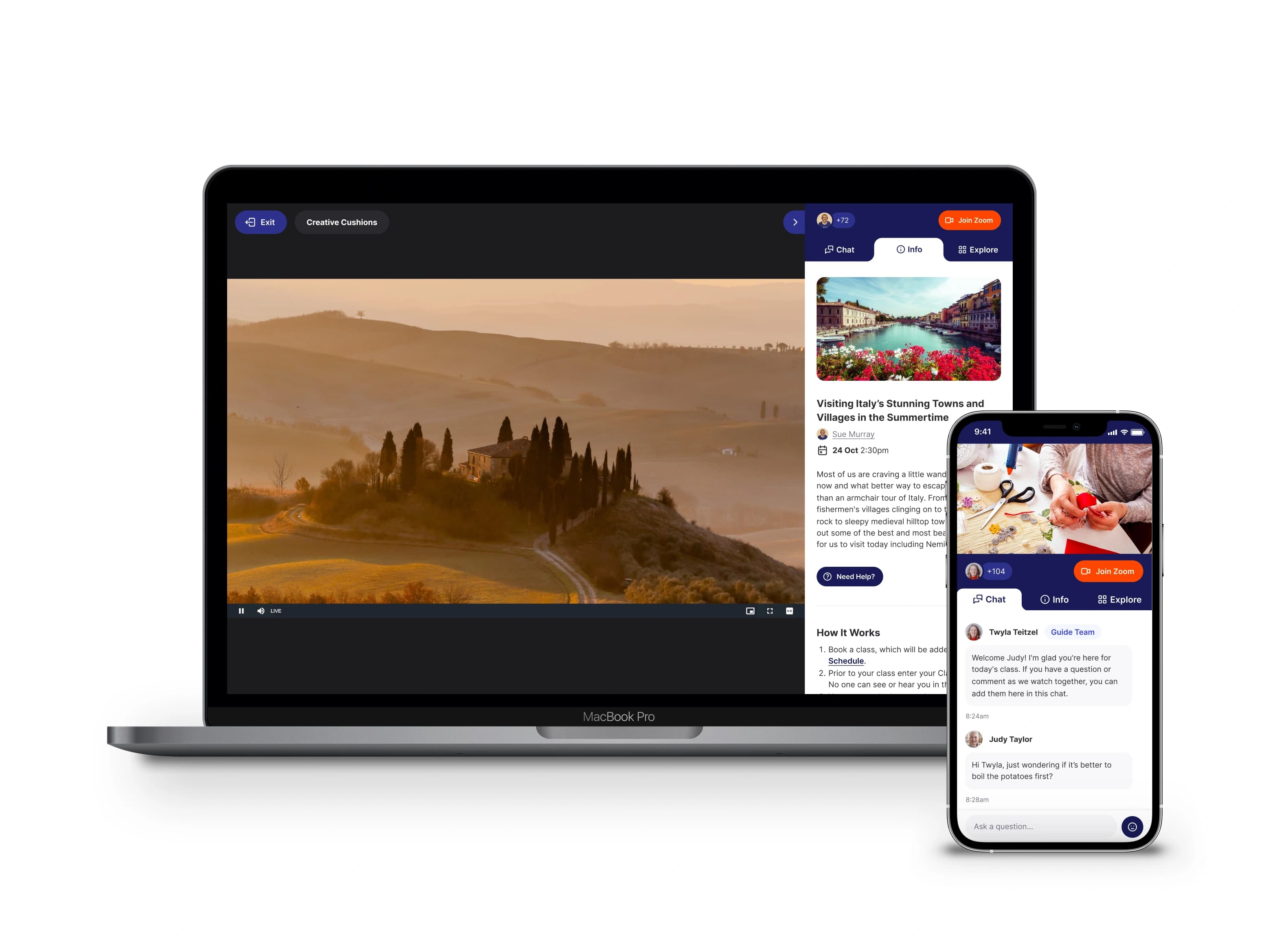
The in-class experience consolidated chat, class information and related sessions into one sidebar. Clearer signup prompts increased registrations by 27% and chat messages by 4%.